


7.0 update is our biggest update for the whole time of development. It will change the whole workflow of how you use the plugin and this update is the final point of our Productivity Stage of development. Let’s dive into mind-blowing new features.
CSS variables
We already implemented a class system. Now, let’s move further, and let me introduce variables. Now, you can add them in most of the fields, you can make variable components and you can select them. When do you need variables and when do you need classes? Both can be used for the same purposes. But my advice – classes is working more like components, because you can use them also for subselectors. While variables are for separate options.
For example, if you want to make a common design for Buttons – use classes. If you want to have common spacing for many elements – use Variables
Figma Stylebook creator
Interaction Panels
Now, you can build your own scripts and interaction logic between elements. In the video above you can find examples of how it can be used. We will discuss this topic more deeply in upcoming videos. In short – you can add a trigger to any element and you can add a chain of different actions
Grid Range Builder
Previously we added Visual builder for css grid which can help to change width and gap. Now, we also added option to build ranges visually. You can make complex grids. This will work not only for static block but also for Query Loop, Repeater field and dynamic/static galleries
Stylebook improvements
Now, you can add elements, colors, gradients, variables, classes. We also added clone of stylebook to sidebar panel in posts and FSE, so, you can easily change global parameters from sidebar. Click on G icon for this in top right corner
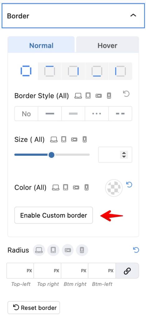
Complex shadow, borders
If you need more advanced borders or shadows, use Custom button
Tabs design was recreated
Previously tabs used our old panels, now, it’s migrated to new components. And now you can have much more control for tab style

The video box supports Live links for YouTube
Live YouTube player have become more popular so our video box now supports it
There are many other improvements under the hood, especially in the Admin panels design.
Deprecation
Typography presets will be removed. If you used them early, they will work on existed pages, but keep in mind that once you edit a block, you will lose the typography preset.
Currently, we recommend you investigate our class and variable system which are way more flexible. And for adding presets for default headings, it’s much more useful to use Stylebook Elements.
Also, don’t forget that reusable styles will be removed in a month. You can copy and save your existing reusable styles in Greenshift – Settings – CSS options if you plan to continue using them.