


After some time and investigation, we want to share with you some thoughts how to make almost perfect Web vitals on very heavy page with animation.
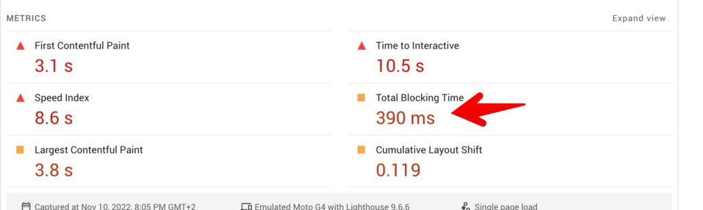
As example, we use our homepage. As you see, it has a lot of animations and scripts and huge amount of graphic. We used very light and optimized BlockPress theme and extremely performant Greenshift plugin which makes all the job automatically but still I was not able to get more than 80 score on mobiles. And problem is in scripts. You may have very optimized scripts, but if you have too much scipts on page, you can’t get good score.
And there is one reason of this – how browser executes web pages.
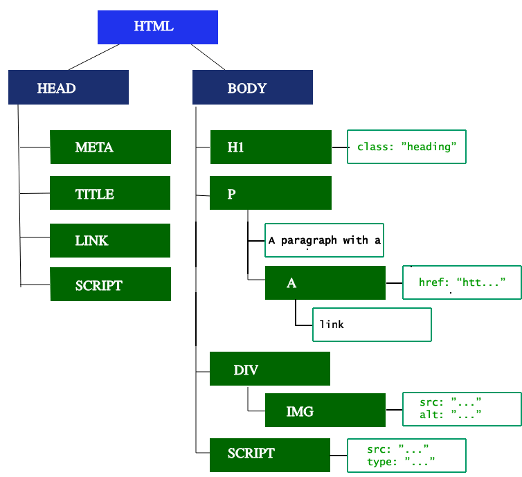
Browser loads assets which you have in Head section. Usually, it’s meta tags and styles. Then, Content of page and scripts in end. And this is a problem, because if you have any kind of script related elements in top section – browser will executes it only after everything is loaded. This will reduce LCP and if you have big page with many elements, you can expect near 20-30 point drop on web vitals.
Why do not place scripts in head section? Because in this case, you will get another problem – render blocking error
Another problem is images. Any image in WordPress has lazy load by default and this is great, until you place image in top part of site. In this scenario, it will do opposite and will be delayed in loading, so LCP will be reduced.
So, we did next.
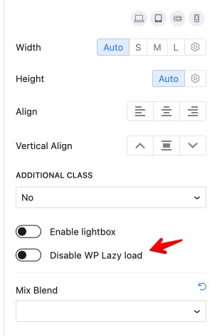
Remove lazy loading in top imagesTo improve LCP
WordPress doesn’t have option to remove lazy loading in images, fortunately, Greenshift plugin has it. So, use Image block in Greenshift for all top level images (including site logo) and disable lazy loading there
Use simple elements in your first screenThis is affecting web vitals a lot
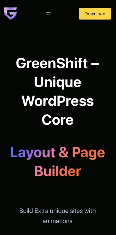
What you have in first screen – is 60% of your score. So, if you want to have better score – make sure that you use simple elements in first screen. Better – Text or SVG (and without custom fonts). They must cover whole screen on mobiles. You can have everything which you want on desktop, but first screen of mobile version must be very simple. Check our example
And in Greenshift we have few helpers to get this
- Order in Columns and CSS grid elements. This can help you to place column which is on right side on your desktop to be first one on mobiles
- Option to disable background on each resolution. Users don’t estimate your super cool background on mobiles, because, they will not see it perfectly, so, better to disable heavy backgrounds on mobiles.
- If you want to have graphical elements in top screen on mobiles – use SVG shape block and Custom code. it’s important to use SVG as code and not as image because code is executed immediately
- You can also use Lottie Animation Block and special Smart Load feature. This feature will delay animation and speed will be not affected even if you have extremely heavy lottie file.
- The same Smart load feature is available in Slider, 3d block and others, but we still recommend to have simple first screen if speed is important for you
- There are many design features in Greenshift to improve simple elements – gradient animation (which doesn’t use scripts), text gradients, CSS transformation
Avoid using any scripts and animation in first screenBuild complex layouts easily
It doesn’t matter how good is your page, but heavy js libraries can destroy your score. So, what is the solution – DON’T use heavy js libraries.
Ok, if it’s not your scenario (for example, we must show good sides of our plugin on home page and it’s not possible without complex animations), then, there is the way to control this.
In Greenshift 5.0, you can enable the delay option for scripts. This option will delay extra heavy animations and scripts and they will be loaded only on user interactions. In the same time we keep basic animations from the Advanced – Animation panel, because it’s made on super light custom script. So, avoid using extra heavy animations, media, script related blocks in first screen of mobile view and replace them via simple animations or static text. Place your script-related blocks in second screen where users can get only when they scroll page.
What does it make? The same as our smart loaders for blocks, but it does this for whole page. Users (and google bots) will see page without scripts first, then, once they start to interact on page, scripts will be loaded.
Attention. This option is experimental, currently, it will delay only Greenshift-related scripts and keep your other scripts as not touched. We recommend to use this feature only on specific pages where you have heavy animations. You can enable script delay feature in Greenshift settings – Script Management
If you want to delay all scripts of site, you can try to use Wp rocket plugin and it’s feature Delayed Scripts.
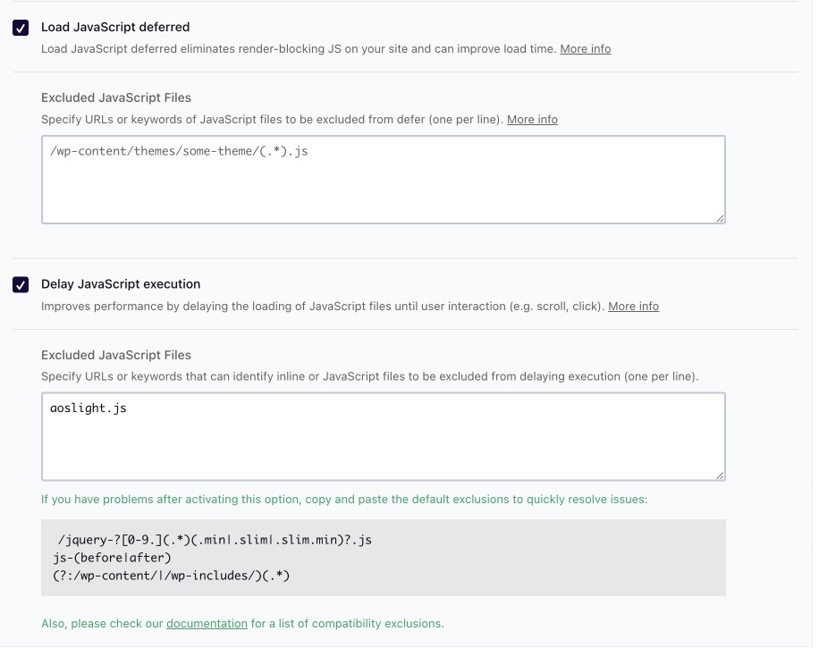
Wp Rocket is premium plugin, but the same option is available in free plugins. For example, Flying Scripts (which can be also useful to delay Analytics and other external plugins)
Again, it’s important to have simple first screen on mobiles to make this helpful. Also, if you check Excluded option, we added aoslight.js there. It’s because we still want to use some animations before scripts execution.
Reusable template Ajax loadingDelay loading of whole page
And this is another unique feature of Greenshift. You can delay loading not only just block’s scripts but whole section or even page. So, for perfect score, you can make static first screen, then, make rest of page as reusable and use Ajax loading for this reusable template. Check how it’s working in our unique features section
This can also solve problem with big Dom size of page. And we use this feature to load our heavy SVG animated section
But this can be dangerous. Because not always all scripts can work perfectly when they are loaded in ajax request. Also, we found that this can give more loading on server, so, you need to have enough CPU server memory. So, experiment before you implement this.