


Many users who want to switch from Elementor or other builders to core editor of WordPress are confused and leave their efforts because they can’t set proper width for their layouts. So, in this tutorial, I want to share with you the difference between Gutenberg core editor, common scenarios, and how to use the proper width option.
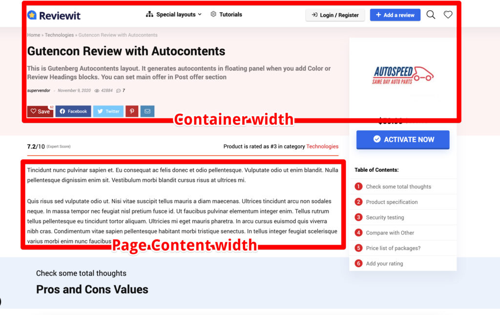
First of all, we need to define two options which are existed on your site: Container width and Page Content Width. Container width is the maximum width of all content on your site. Content width is the maximum width of the post content area (it’s what you add in your post editor). Different themes have a different value for container width. Container width is not always equal to the content width. In this example, you can see that our content width is less than the container width. It’s because Container has also a side block with the logo, TOC.
And here we have a few problems which usually confuse users.
Problem 1 – there is no standard on how container width is set in WordPress themes. It can be set in Customizer, theme options, in custom panels, or via templates. You need to know the Container width from the author of theme.
Problem 2 – width of content which you see inside your editor can be not the same as you see on your site because not all themes are optimized for Gutenberg. Best way to see if the theme is optimized for the WordPress editor is to find the file theme.json. In the current point, this is the way how all themes must configure style options. If your theme has no theme.json file for WordPress, suggest author to add it. Classic themes also can have editor.css file instead of theme.json, but it’s still recommended to use theme.json API for all themes, including classic themes.
How to add proper layout width on page in Greenshift
Let me explain how to fix both problems now.
How to set full width of the block
First of all, you need to know about the width Align option in Gutenberg. All blocks which can have extended width, have a special icon in the toolbar.
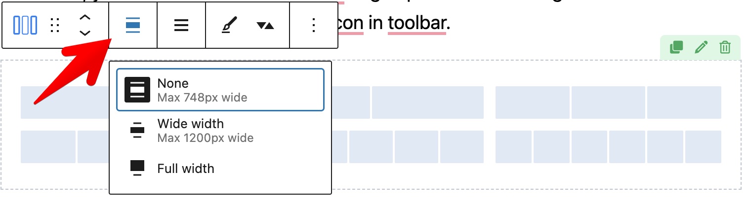
This option allows you to extend width of block from Page Content width to Full width. This option works only if your theme supports align width possibility for WordPress. Hopefully, all popular and well-coded themes support this nowadays.
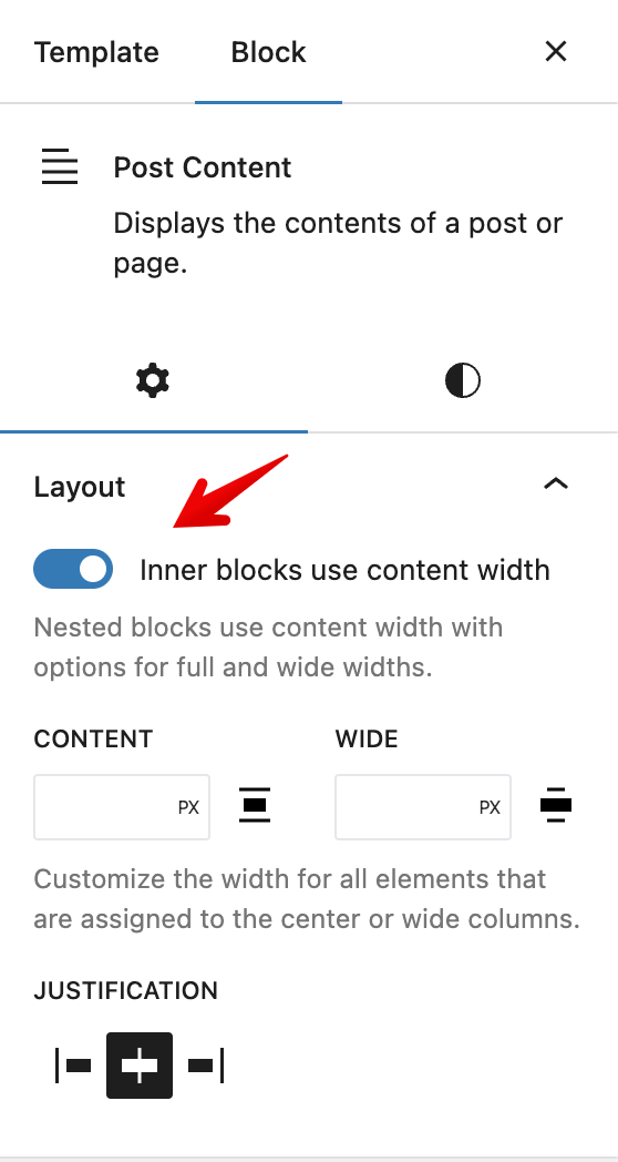
Sometimes you may have a situation when you have no option for full width but theme supports it. in most cases, it’s because you use FSE templates and you didn’t enable next option in the Post Content part
How to set full width background of block but centered content
This is the most common scenario on your custom pages. You may want to have Full width background, but the content should be in the center.
Set proper page templateUse page template or theme’s options
First of all, you need to select proper post/page template. Each theme has a different set of templates which are affecting how content and container connected with each other. The best way is to use page template which has equal Content and Container width (it means that page will not have predefined sidebars).
If you are not sure which template is correct, you can use Greenshift Full width template (header, footer from theme and content part is from Greenshift) or Greenshift clean canvas (totally clean page)
In many themes, template is also controlled by special theme panels. We recommend to use them instead of template selection. Greenshift Full width template is your last resort if you can’t find proper theme’s template for your page
Use Row block of GreenshiftBuild complex layouts easily
Second, to control layout options, use Row block of Greenshift plugin (it has blue icon)
Row block allows you to set block as full width but still keep centered container part and configure it’s width (your main Container width) inside Row options instead of theme. By default, content width of Row is 1200px, you can change this in options of Row. Also, in Greenshift – settings – Breakpoints, you can set default width of your content (ask author of theme which default container width they have).
Columns padding
A row block is not just a container. It has also columns and you can select different column structures. Each column has predefined extra padding. So, if you want to remove and make inner content fill whole available space, select a column and set its padding as zero
You can select column if you click on parent icon of content (it’s one column blue icon) or inside navigator
Don’t use Row block everywhere. If you need just text in your post, you don’t need to use Row block. Use Row block only when you want to control width of container and inner content or you need columns. This can be helpful if you build custom homepage or landing page.
Containers and layouts in FSE themes
If you use FSE block theme like BlockPress, Twenty twenty two theme and you edit templates in Site editor, you need to add parent Group block. It’s not clear why, but this is required in current point for FSE templates for proper width settings. This can be changed in future, but in current point, you need to make next layout settings
So, you need to add Group block, set option “Inherit Layout properties”, then, drop Row block.
Othewise, your page will not have Content width and it will be always as width of browser.
For more details about Layout options and possibilities, check our video